


 🔔 Affiliate Disclosure
This content may contain affiliate links. If you click on a link and make a purchase, we may receive a small commission — at no extra cost to you. Thank you for supporting BeatInsights! 💛
🔔 Affiliate Disclosure
This content may contain affiliate links. If you click on a link and make a purchase, we may receive a small commission — at no extra cost to you. Thank you for supporting BeatInsights! 💛
Understanding the Affinity Diagram
The Affinity Diagram helps teams group ideas for analysis. This powerful tool organizes thoughts and data. It uses effective qualitative data organization methods. This approach allows groups to turn brainstorming into actionable insights. It supports a structured user research synthesis process. The Affinity Diagram transforms chaos into clarity.
This method, also known as the KJ Method, originated in Japan. It was developed by Jiro Kawakita in the 1960s. Its core purpose is to sort a large number of ideas into natural relationships. People use it to find common themes in messy information. It helps teams make sense of complex problems.
Organizing ideas is critical in modern business. Companies face vast amounts of information daily. Without proper structure, this data becomes overwhelming. It hinders clear communication and sound decision-making. Therefore, Affinity Diagrams provide a framework for this order. They bridge the gap between raw data and strategic action. This guide will explore the benefits and steps for creating these diagrams. You will learn how to apply them in real-world situations.
The Power of Grouping Ideas: Benefits and Use Cases
Using an Affinity Diagram offers many advantages. It helps clarify complex problems. Large amounts of fuzzy data become understandable. Teams can identify hidden patterns and themes. These connections might not be obvious at first glance. The diagram fosters strong team collaboration and consensus. All members contribute to the grouping process. This shared understanding builds buy-in. It also streamlines decision-making processes. Teams can make choices based on clear, organized insights. The Affinity Diagram translates brainstorming chaos into order. It moves from many thoughts to a few key insights.
Key Benefits of Using an Affinity Diagram
- Clarifies complex problems and issues.
- Identifies hidden patterns and themes in data.
- Fosters team collaboration and consensus.
- Streamlines decision-making processes.
- Translates brainstorming chaos into order.
When to Use an Affinity Diagram
An Affinity Diagram is ideal in specific situations. Use it after extensive brainstorming sessions. It organizes many diverse ideas generated by a group. It is perfect for analyzing customer feedback or user research. This helps find common pain points or desires. Apply it for problem-solving and root cause analysis. It reveals the core issues behind symptoms. The tool aids strategic planning and goal setting. It helps organize future directions. Use it for requirements gathering in projects. This ensures all needs are captured and grouped. Learning how to group ideas for analysis is crucial here.
Step-by-Step Guide: Creating Your Own Affinity Diagram
Creating an Affinity Diagram involves several distinct phases. However, each step builds on the last. Following this guide ensures effective results. This method makes qualitative data organization methods accessible.
Phase 1: Idea Generation & Data Gathering
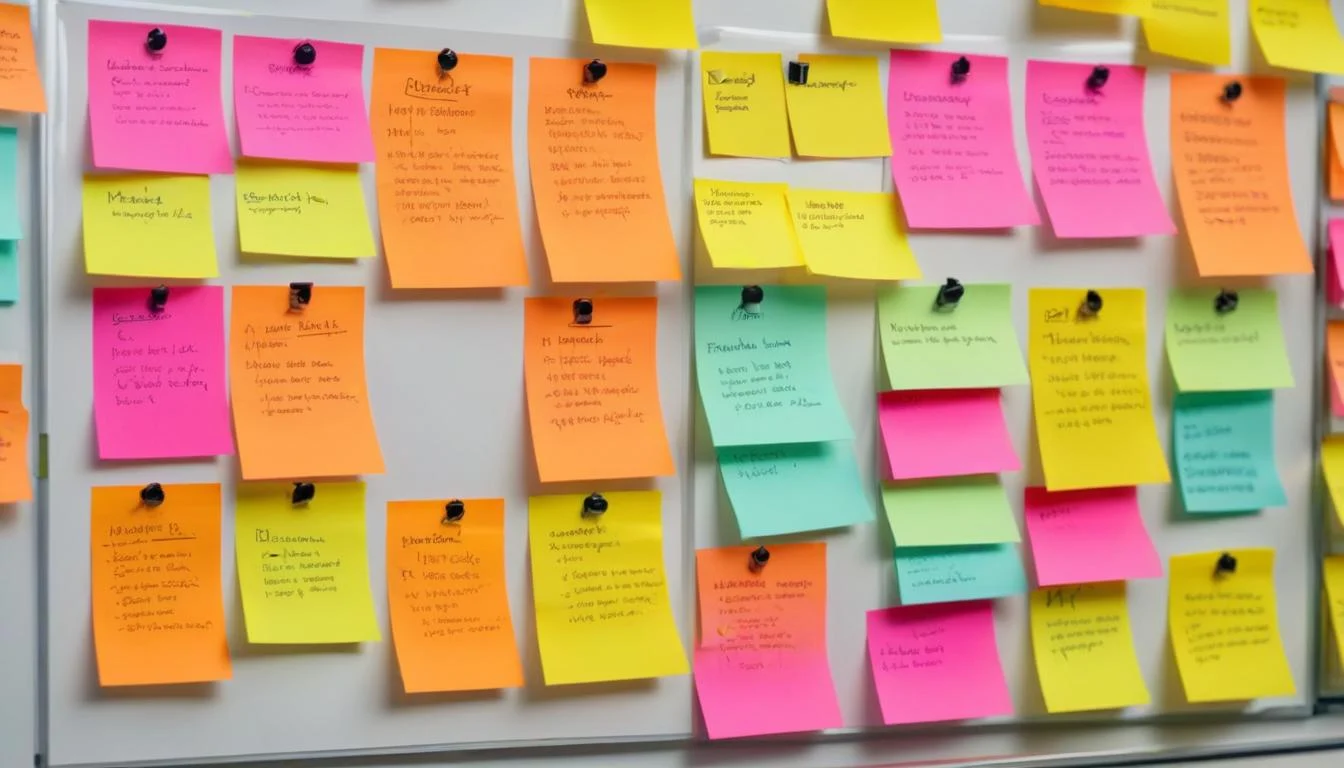
Begin by gathering all your unstructured data. This includes notes from interviews or brainstorming output. Use sticky notes and thick markers. Digital tools like Miro or Mural also work well. Each idea must go on a separate note. Keep ideas short and distinct. Focus on quantity over quality at this stage. Capture every thought without judgment. This raw collection forms the base.
Phase 2: Silent Grouping & Categorization
Display all your sticky notes randomly on a wall or board. Now, the “silent sort” begins. Team members move related ideas into groups. Do this without any talking or discussion. Let natural affinities emerge. Look for items that seem to belong together. This phase reveals hidden relationships. Grouping related items helps turn brainstorming into actionable insights.

Phase 3: Labeling and Synthesis
Once silent grouping is complete, create headers for each group. These are called Affinity Headers or Category Cards. Each header should describe the group’s main theme. Make labels concise, descriptive, and meaningful. Discuss each group and its header with the team. Refine groups by merging small ones or splitting large ones. This ensures clear and logical categories. This synthesis step solidifies your findings.
Phase 4: Interpretation and Action
Now discuss the organized groups and their headers. What key insights do they reveal? Look for relationships between different groups. Drawing arrows between categories can show these connections. This is an optional but powerful step. Prioritize the most important insights. Then, develop clear, actionable next steps. This ensures your user research synthesis process leads to real outcomes. Use the Affinity Diagram to drive your plans. Learn more about its structure and purpose from the American Society for Quality.
Practical Applications & Real-World Examples
The Affinity Diagram proves useful across many industries. Companies use it to understand complex challenges. For example, a software company might analyze user feedback. They collect hundreds of comments after a new feature launch. Using an Affinity Diagram, they group these comments. They find themes like “interface confusion” or “missing data export options.” This helps them prioritize development fixes. They turn brainstorming into actionable insights by seeing clear patterns.
In addition, another instance involves a healthcare provider. They gather suggestions from staff on improving patient flow. Notes might include ideas about scheduling, room turnover, and communication. An Affinity Diagram helps group these ideas. Categories like “Pre-admission Process” and “Inter-departmental Communication” emerge. This guides them in making targeted improvements. It is a vital tool for qualitative data organization methods.
A car manufacturer might use it to understand warranty claims data. They group diverse issues like “engine noise” or “electrical faults.” This helps identify common manufacturing defects. The Affinity Diagram provides clear direction for solving these problems. It helps identify patterns that might otherwise be missed. This ensures comprehensive user research synthesis process outcomes.
Harnessing the Power of Affinity Diagrams for Business Growth
The Affinity Diagram is a powerful tool. It helps teams organize many ideas. People use it to group ideas for analysis. This is a core method for qualitative data organization methods. This process helps turn brainstorming into actionable insights. It makes complex information clear, especially in user research synthesis process. This method allows teams to find themes and relationships. It moves from scattered thoughts to structured plans.
Product Development and UX Design
Teams use the Affinity Diagram to synthesize user research findings. They collect data from interviews, surveys, and observations. This data often appears as many individual notes. Grouping these notes reveals user pain points. It shows unmet needs. Design teams then prioritize features based on user needs. This method ensures new products truly help users. It leads to better design choices.
Business Process Improvement
The Affinity Diagram also improves business operations. It helps identify bottlenecks in workflows. Teams list all steps and problems in a process. Grouping these problems shows common issues. This allows for focused improvements. Leaders can then streamline operations and enhance efficiency. The diagram creates a clear path to better business practices.
Marketing and Customer Insights
For marketing, this tool is invaluable. Teams analyze customer feedback and market trends. They gather comments from social media, support tickets, and sales data. An Affinity Diagram helps sort these diverse insights. It reveals key customer desires or market gaps. This information guides developing targeted marketing strategies. It ensures messages resonate with the right audience.
Team and Organizational Development
Collaboration greatly benefits from an Affinity Diagram. It facilitates consensus in group problem solving. All team members contribute ideas freely. Grouping these ideas together helps everyone see common ground. This builds shared understanding. It also helps in structuring complex project planning. Teams break down large projects into manageable themes. This makes planning clear and achievable.
Maximizing Your Affinity Diagram’s Impact
Effective facilitation is key to success. A neutral guide helps the group stay focused. This person ensures everyone participates. Timeboxing also helps keep the process on track. Set clear limits for each phase. For instance, allow 15 minutes for silent idea generation. Then, give 30 minutes for initial grouping.
Encouraging participation ensures all voices are heard. Everyone should feel comfortable sharing ideas. No idea is too small or too strange. Teams can use physical or digital tools. Whiteboards with sticky notes are common. Digital platforms like Miro or Mural offer more flexibility. Trello also works for simple grouping.
Maintaining objectivity is very important. Avoid premature judgments about ideas. Let the groups form naturally. Clear documentation captures the final diagram and key insights. Take photos or save digital boards. This record helps later analysis and action. An Affinity Diagram is only useful if documented properly.
Avoiding Common Pitfalls with Affinity Diagrams
Be careful of premature categorization. Do not jump to conclusions before all ideas are out. Allow the brainstorming phase to finish fully. Over-analysis of individual ideas also slows progress. Focus on broad themes first. Details come later. Furthermore, dominant personalities can sway group decisions. Ensure equal contribution during grouping. Remind everyone to respect diverse viewpoints.
Vague or misleading group headers cause confusion. Labels must accurately reflect content. Rework headers until they are clear and precise. Sometimes, ideas do not fit well into existing groups. Do not force ideas into groups. These “orphan” ideas might form new categories. They could also be unique insights needing separate review.
A significant pitfall is lack of follow-through. Generating insights is one step. Taking action is the next. Use the Affinity Diagram to guide next steps. This ensures the effort leads to real change. Always plan how to use the grouped information. This makes the Affinity Diagram truly useful for user research synthesis process.
Advanced Affinity Diagram Techniques
Consider hierarchical Affinity Diagrams for complex topics. This involves creating sub-groups and parent categories. It brings even greater structure to vast data sets. You can also combine this tool with Interrelationship Digraphs. This maps causal connections between groups. It helps understand how different themes affect each other.
Integrating with prioritization matrices acts on key Affinity groups. After grouping ideas, use a matrix to rank them. This helps decide which actions to take first. Digital Affinity Diagram tools offer many advanced features. Explore platforms like Miro, Mural, or Lucidspark for advanced options. These tools support large teams. They also handle extensive data sets. Scaling Affinity Diagramming becomes easier with the right digital platform. This ensures efficient qualitative data organization methods for large projects.
Conclusion: Transforming Chaos into Clarity with Affinity Diagrams
The Affinity Diagram is a versatile and powerful method. It turns raw information into clear understanding. This tool helps organize information. It also drives innovation across many fields. From product design to business efficiency, its value is immense. It allows teams to effectively group ideas for analysis. Use this method to turn brainstorming into actionable insights. Start unlocking insights today. Implement the Affinity Diagram.